Thursday, February 26, 2009

Spatial hierarchy/vantage point

The spatial hierarchy in "The Performers" can be seen row by row.  The main focus is on the musicians in the front row.  There is activity in each row back--parents and grandparents taking pictures, videos, and looking bored, but none of this is the central purpose of the picture.  The audience creates space.


Vantage Point is key in James Horan's photograph of this man and a little girl.  The man's hands make the picture--they are in your face, creating an obvious focal point.  If they were in any other position, your eye might be drawn to the little girl in the middle ground, and less so to the man in the foreground.  Because the camera is angled above the man, and you can't see his arms, his hands become super big and powerful.

Wednesday, February 25, 2009

Spatial Hierarchy--


This image shows a clear spatial hierarchy. The photographer shows a foreground, which your eyes look at instantly, the street signs, a middle ground--the street light, the building behind it, and a background--which is the sky. While all three are sharp, the sharpest appears in the foreground and is eye-catching. The vantage point in the photograph also makes the image work really well in showing the hierarchy, if it had been different you never would have gotten the same serenity as was in this photograph.


Vantage Point--

This image by Ansel Adams shows a clear vantage point. The "key to flatness" here shows that this picture solves the image. The camera itself is placed low to the ground, making the eye immidiately jump to the lines on the pavement. Upon further notice, we, as the viewers, are getting an idea of continuance because of the vantage point we are given. If the camera had been any higher, we would not have the sense of being right there on the road and following the path it creates. The deatil in the clouds creates an effect also, and had it been different weather conditions, the photograph would not have worked as well. The vantage point here gives us that sense that we are in the photograph, making it difficult to see the photo as flat.

The Depicitive Level

Mary Ellen Mark – Amanda and Her Cousin, Amy Valdese, North California

Spatial hierarchy refers to the ranking of emphasis based on focus in a photograph. Typically, the photograph's subject will be most in focus while the rest of the depicted content hold different levels of sharpness. The observer's attention immediately goes toward what's most in focus, though there may still be important content in the photograph. In Mark's photograph, the girl standing is presumably the subject based on the fact that she's on the highest plane of focus. Everything about her is sharp, from her fingernails to her earrings to the ash on her cigarette. You can even tell that she's wearing eyeliner. The other girl, though less sharp and in focus, contributes heavily to the composition and interpretative meaning of the photograph, but probably isn't the subject.

Josef Koudelka – Kendice

"Vantage point is the key to Flatness – it can solve the picture more than compose one."

Instead of composing a photograph by constructing an artificial scene, one can alter his or her vantage point to find that 'perfect moment,' though in terms of visual relationships and not time. In Koudelka's piece, he found a vantage point that highlights the wall decoration as well as his subjects. The two are placed in a visual juxtaposition that makes the curved line look like it's flowing from the man's head into the head of the little boy, or the other way around.

vantage point and spatial hierarchy


I believe that this photo is a good example of vantage point being the "key to flatness"--although there is obviously a subject of the photo (the suited man in the foreground), we clearly get to see the people in the background as well, their actions making a straight line across the middle. One second before or after, and this photo might not have worked as well. We also get to see a glimpse of what the suited man might be seeing--his "vantage point."


The shallow depth of field of this photo definitely separates the the photo's subject from it's contents, and therefore outlines the spatial hierarchy present. The sharpness of the glasses in the foreground (the photo's"plane of focus") draws us to them, and only at a second look can we separate the chairs from the table and the shadowy figure of the person in the background.

engaging movement

I see both Vantage point and spatial hierarchy as crucial components of this image. Because of the specific vantage point from which this photograph is taken, the viewer's gaze is able to travel along with the flow of the water. If taken from any other vantage point, the water may have a completely different feel. Furthermore, the way the photographer has positioned him/herself in the landscape lends the spatial hierarchy of the image to be both complex and engaging. There is a ton of movement within this photograph, and the space is organized in such a way that the viewer cannot help but move his/her focus along with the stream of the water.

Tuesday, February 24, 2009

Spatial Heirarchy


This image has an obvious foreground, mid, and background organization--showcasing its spatial hierarchy). The photographer probably captured the space in this picture to purposely depict the natural organization of these formations from the specific vantage point her or she took. Foreground (cliff/boulder to immediate left), Mid (grassy knoll/ closest hill), Background (water/distant landscape/sky).

Vantage Point


This picture is titled "Phantom, Cape Disappointment, Oregon, 2006" and was taken of this man (a fellow photographer) who walks up the spiraled stair case of the North Head Lighthouse. In his blog, the photographer writes: "Using the image stabilization feature of my camera, I was able to hand-hold this image at one full second in the dark stairwell of the lighthouse as a fellow photographer, unaware of my presence, came walking up the steps. There is some minor blurring of the stairs and wall, but it supports the central point of the image: movement in time. When my fellow photographer saw me, he stopped in his tracks and looked up, blurring only his face. He graciously apologized for “ruining” my picture. Yet he gave me exactly what I wanted. A phantom. It is the face and the shadow coming out of the body that gives up the ghost here – a function of my high vantage point."

The photographer purposely did not control his subject in a way that "composed" an exact, still picture relative to time. Rather, due to the movement (namely of the subject's face), and high vantage point, a phantom picture resulted, and the photographer depictivley "solves" the message communicated in this image--accepting the results of the random movement of his unknowing subject.

Keeping with the Sally Mann theme, looking at her various works reveals how much spatial hierarchy is used to create different meanings in her work. In this first image, we get very little spatial hierarchy. We as viewers only see the subject and the background. In this image, Mann is able to use limited spatial hierarchy in order to startle us because we are forced, whether we want to or not, to look at the subject’s face.


In the second photograph, there is more depth of field. The viewer sees the shoes and toy shopping cart as most immediate images. Still, the children, who are in the center, have the greatest focus spatially. By having the subjects further from the camera, Mann is able to allow us to see more of their word and to draw our attention to many different objects that form a world we create around the photograph. The way the floor boards line bottom of the picture and the contrast of the blurry sky versus the sharpness of the objects closest to the camera all combine to create a sense of what the picture is about.

This image conveys to me just how much vantage point controls the meaning and mood of a photograph. In Sally Mann’s photograph, the fact that the camera is pointed down on the subject adds and even creates the meaning. In many ways, the vantage point unites with the worn down horse figure and the hazy expression on the child’s face. The vantage point seems to pressure if not force us to make some kind of judgment of the subject’s childhood. Her nudity, combined with the fragile yet natural way she covers herself seems to make the meaning of the piece much more apparent when analyzed in connection with the vantage point.

Sunday, February 22, 2009


Both of these pictures have different spacial hierarchy. The first one has a shallow depth of field, so we draw our attention to the little girl and the birds, and don't pay much attention to what is in the background. This isolates the girl from everything else . The second picture has a less hierarchical emphasis due to the increase in depth of field. This picture still has many levels though, and our attention diminishes as we look past the boats ( and the sharpness drops off). This plane of focus grabs our attention to the boats/
The Vantage point solves this picture more than composes it because it gives it definite meaning and shows you what is important in the picture. The focus on the hand represents something in particular and solves the "problem" or purpose of the picture.

Wednesday, February 18, 2009

Vince's Reflection: Art Event in Boyden Gallery--> Panel Discussion on Color

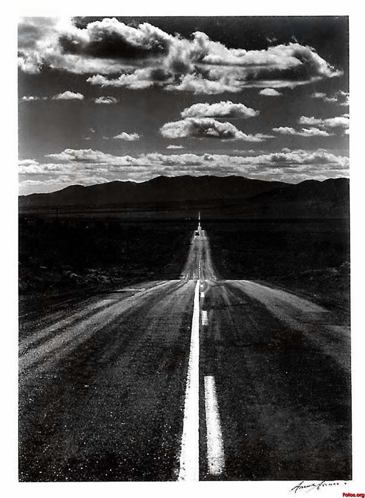
An interesting panel discussion in Boyden Gallery was held on February 4th. The panel comprised of six professional academics (or scholars) who where asked to provide an intellectual discourse (in the form of informal discussion—not debate) on the topic of color. The discussion was mediated by an art/art history professor and included faculty members from the departments of psychology, archeology, physics, and religious studies/philosophy (specializing in phenomenology). The discussion also included an artist whose painting was featured in the gallery.

The main topic of discussion provoked the question: ‘how do we come to understand art and what it means to different perspectives?’ This was accomplished through discourse surrounding concepts of color and spatial influence.

I purposely attended this art event because I was excited to here interdisciplinary discussion on this perceptually abstract topic. It's not often that we, as students, get to here faculty discuss abstractions. It turned out that each of the individual scholars contributing to the discussion added what I had originally expected them to contribute: the psychologist wondered how we, as human, find an importance in being able to both create and decipher color variations, and the physicist was interested in how specific wave lengths of pigments enter the eye (atmospheric optics) and was also intrigued by the plethora of wavelengths ‘unseeable’ to the human eye. The archeologist (Prof. Julie King) provided the most practical or tangible understanding and use of color out of all of the panelists. She said that in her field, it is incredibly important in understanding the date/time/setting of a given archeological site by discerning the various colors of dirt strata. She referred to a cathedral she recently visited to highlight this notion.

Less tangible, in a sense, were the physicist and philosopher who spoke of various concepts of color using abstract and often discursive language. At times the panel drifted into highly abstract arenas of understanding how color is created and perceived—this was entertaining for me to hear because of its incredible lack of accessibility at certain points, but was also interesting because what was being discussed ultimately achieved intellectual agreement across the panel—perhaps an indication of the inherently cohesive liberal and artistic college community.
In all, I enjoyed the discussion because it posed many hypothetical answers to questions (i.e. why/how does the human perspective determine experience?) which, in turn, posed/created even more, perhaps unanswerable, questions (such as, “where does the experience of color come from?” and “how does our biology/coordination of movement effect our experience with pigments?”)

The discussion successfully satisfied my interest in hearing a bunch of egg-headed intellectuals throw big words and abstract ideas into the cauldron of scholarly discourse focused upon color perception. I would have liked to see prof. Curt Raney from the sociology department add his spin, however. His perspective could have added profound amounts of logic to the already ‘rational-ish’ discussion.
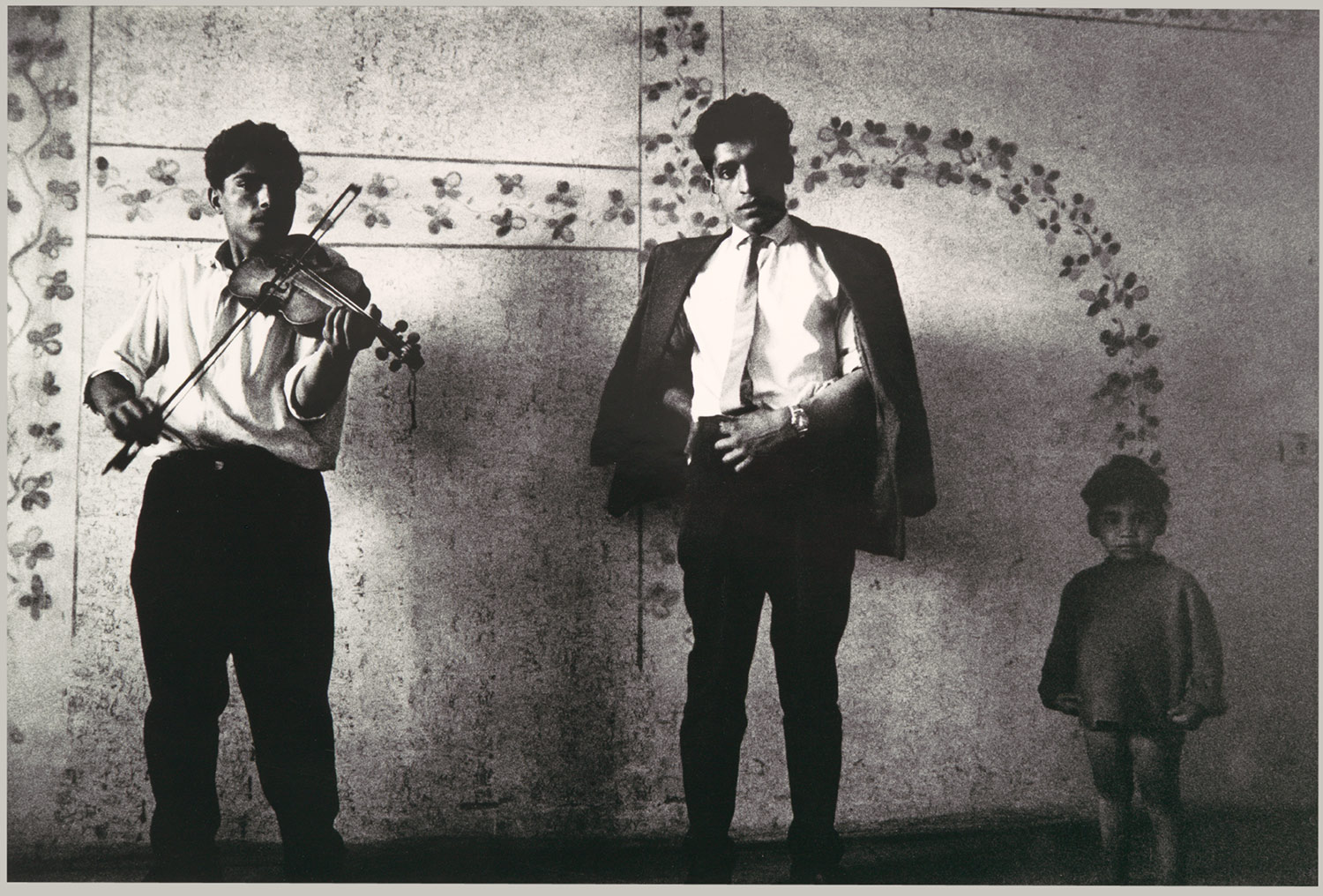
Monday, January 26, 2009

Nadja's response to quote

Response to Quote


The quote I enjoyed best was the first one written by Roland Barthes. Like photography, it captures the spirit of that magic moment he experiences at that particular time and space. This is also what those pictures mean to him. Each of these pictures capture a certain moment of his mother’s life in the exact time, space, age and mood she was back then. Captured in a picture, these moments will always live on, every time a person looks at them. This is what makes photography so interesting and important. It can remind you of moments in a way that no stories or descriptions can do it. Just by a look at her face, Barthes is reminded of more than just this moment, but also a personality and a figure his mother was to him. It is not only a person in front of a setting. These photographies evoke emotions he felt back then, he tries to remember now, and he can feel again later in his life, even after that person, who made him feel this way, has passed away. I think, this is the major reason why we love taking pictures- because we know that they will remind us of that day, that mood, and the experience belonging to it later in our lives and help us to live them again in our memories.

Thursday, January 22, 2009